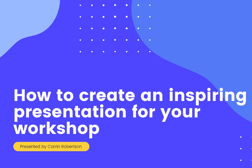
How to Create an Inspiring Presentation for your Workshop
Have you ever been at a presentation or workshop and found yourself forcing your eyes to stay open?
Bored out of your mind, and struggling to focus, the host is bleating on… and on. The concepts are too hard to follow, the words becoming a meaningless, tiresome cloud. Next time you struggle to sleep, it’ll be this guy’s waffling drivel that’ll send you to the land of nod.
Together, we’ll discover how to put the “Pow!” back into PowerPoint.
In this article we’ll explore:
- Why visual presentations are important
- What to consider when planning presentations
- How to design an engaging visual presentation
- How to choose an engaging format
- Which tools are best for designing presentations
- Tips on how to deliver your workshop presentation
Why Are Visual Presentations Important?
The purpose is to share brilliant ideas with an audience. This might be a piece of work or an educational concept in a workshop; the aim is to communicate with people, make them feel something, and take action. We all want our audience to leave an event feeling motivated and inspired, and that the workshop was of value.
The importance of visuals is often overlooked, either due to a lack of confidence in working with visual design, lack of time or both. For a workshop facilitator, using visual aids could actually save time, better represent our ideas and concepts to a group, and help you present more confidently. “How?”, you ask.
When it comes to saving time, a picture is really worth a thousand words. There is no need to type up your presentations or make wordy bullet points on every slide when a simple image can share the message for you.
Visual presentations put across an immediate message. Images are emotive and can deliver a story much faster than words, visuals are processed 60,000 times faster in the brain than text. An image that can share an idea, can be more memorable than trying to remember very specific terminology.
Creating visuals becomes part of a wider conversation in inclusive communication. Images are universally understood, and the eyes can “read” a picture with less effort than reading and comprehending several paragraphs. Imagine describing the color blue as a phrase. It is much easier to present it as it exists.
Graphics are easy to share, and 65% of us are Visual learners. For anyone who has missed out on the meeting, a visual booklet can do the job of sharing the subject with them, and the added benefit of being able to view it in their own time. The power of social media also plays a huge part in the spreading of information and well-designed infographic slides can take your presentations and workshops outside of the room, with the potential to make a global impact. Sharability goes further with visual elements.
For me, a visual presentation is a lifesaver! Using slides has saved me a lot of time and made me feel more confident whilst presenting too. I don’t fumble around with notes, as the visuals can act as a prompt to remind me of where I’m at in my talk.
When presenting online, I find the value of visuals and slides even more important. It takes the attention away from my actions, and onto the graphics themselves. The participants can hear what I’m saying, but their eyes focus on the visual information which helps in retaining information and ideas beyond the workshop.
What to consider when creating a visual presentation
I’m naturally quite a visual person, and I’ve often wondered if I could make a visual presentation without planning first what it is that I want to say. As an experiment, I gave it a go and it was a huge struggle. So, if you think that designing visuals is something that only designers can do and that they find it easy… it doesn’t and they don’t.
As a starting point: get out a pen and paper and write down everything you want to say. This ensures you have all of the ideas and information out in black and white. I find that by leaving space between the writing and structuring, coming back at it with fresh eyes is a perfect way to work without feeling rushed. I rarely add to what I’ve written, it’s mostly about removing.
Recently I had written a LOT of information for an event. A day later, I took a second view to edit. A lot of writing is quite self-indulgent, so it helps to consider the audience. I cut up sections of the paper, keeping only what was the most necessary information, and collated it together. The rest of the sentences didn’t make the cut. You can try the editing exercise here.
Less is More- an exercise in editing #presentation #presentation skills #writing #workshop #meeting design
This exercise is ideal for editing written content in a hands-on way. A simple and effective exercise for editing workshop content or presentation text for talks. Use it when you have to write for a specific audience and want them to stay focused on the most important information.
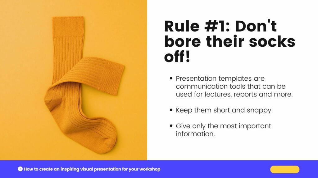
As an expert in your field, it’s likely you’ll have a lot of content, and editing is so valuable to ensure your audience has relevant details. Don’t bore their socks off 😉
So now that you have an idea of your core content, you can move along the process, considering these factors before jumping into the design stages:
- Audience
- Purpose
- Structure
Audience
Let’s start by asking, “who is your audience?“
- if you are being commissioned to present a topic to a pre-determined group, then you’ll need to cater to their understanding of the topic. You’ll want to ensure that the information will be relevant and
meets orgoes beyond their expectations. - if the topic is of your own choice, and the angle you’ve chosen to take, who do you want to take part? Finding them, and attracting them to the workshop will be part of your marketing efforts, as well as how you plan your structure and content.
We wouldn’t plan a workshop for ten-year-olds in the same way we might for adults. Consider what tone of voice you might use, the style in which we present how we use slides, and the content itself. You won’t be able to do this for each and every individual, but how you determine and empathize with your listeners can be done by creating a persona, or several personas.
Create an overarching idea of who might be present, then consider how to engage them and meet their needs by asking yourself the following in more depth:
Why are they there?
Let’s look at their reason for attending your event. Have they come to learn from you in particular? If you are a specialist in your field and the workshop is an area of great interest to people, you’ll most likely have a deep understanding, and along with that, expectations to be filled.
Have they come to gain a better understanding of the topic? Are they there to challenge themselves and their existing views, or perhaps yours?
How much do they know already?
Are your participants already proficient in the topic you’re delivering? You’d hopefully know this in advance of your workshop so you can adapt your material, and create a pitch in line with the group’s knowledge. If their experience level is unknown, an opener to your discussion might be to ask about their subject knowledge, ideas and expectations. That way you can tailor your language and approach.
It helps to be well versed in your workshop, to select sections you can skip out in favor of diving deeper into more advanced information. Improvisation isn’t usually a skill you’d immediately connect with presenting, but with practice, learning how to improvise can become an empowering tool to have.
For beginners, you’ll most likely take an introductory approach. This doesn’t mean it has to be dry or boring. Make it more interesting and engaging by weaving in an interactive exercise, or team debate within your presentation design. That way, the participants can gather more hands-on experience to support their understanding. This can of course use visual handouts, such as a workbook, or include a well-designed visual exercise on an interactive whiteboard.
What is their background and communication style?
Your presentation style, language, and cultural references should be considered in the writing and designing process. I recently attended a workshop on how we can create better inclusion for diverse audiences by considering the language we use. It really made me think about how we often lean towards using English as a “default” language, and how words often hold different weights and contexts in other languages.
Remote workshops and presentations mean we may have a very diverse audience than if we were presenting in-person, in one location. Online could mean 140 people in different time zones across different countries with different backgrounds. Being aware of differences makes it easier to use inclusive, easy-to-understand language in your presentation so that no one feels alienated. Speaking with clear articulation will make a big difference in how you are understood.
You might have the best workshop on the planet, but if you don’t communicate in the style of your group, the impact will be lost. Do they want a short and snappy talk with a clear outcome at the end? Some audiences appreciate a motivational and inspirational talk that is led through emotional storytelling. Knowing their communication preferences can win over or lose your audience.
Purpose
Before you begin designing your presentation, it’s important to consider what your purpose is. This is your mission statement, your project brief and your raison d’être. Here is where you want to ask yourself, what is it that you want your audience to think, feel or do? Are we creating an emotional impact or an educational goal?
Be as clear as possible with your core message, making it as specific as possible, so that you can keep this in mind throughout the process of writing, editing, designing and delivering presentations. This will keep your focus sharp, and avoid any unnecessary derailments taking your viewers away from what it is you hope to achieve.
Common purposes are to: inspire, inform, persuade or entertain.
- I want to inspire the audience to help reduce food poverty by leading a cookery workshop using supermarket waste.
- I want to inform the group about the future of rural tourism, so they might consider how they could adapt their own farming businesses to host visitors.
- I want to persuade my team to reduce our use of plastic in the fashion industry, by presenting a viable alternative made from mushrooms.
- I want to entertain by pretending to be a Martian visiting Earth for the first time. My purpose is to help the participants understand their product from a new perspective!
A Martian Sends a Postcard Home #creative thinking #idea generation #remote-friendly #brainstorming #energizer #team #creative writing
Use Craig Raine’s poem A Martian Sends a Postcard Home to spur creative thinking and encourage perspective shifting in a group. After a warm-up, you can then use this martian perspective to describe your product or service and gain new insights and ideas.
I recently designed a workshop called Design Thinking for Beginners and ran a SessionLab show and tell session aimed at facilitators who would like to run the workshop for teams new to design thinking. If you missed it, you can watch it back here. My purpose was to inform the attendees of the challenges newbies have with design thinking, and how they can make it a fun and digestible process.
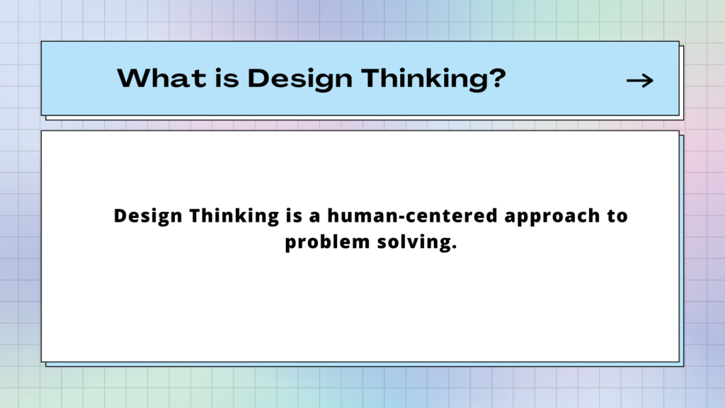
I chose to relate each stage of design thinking to an everyday project of choosing or baking a birthday cake. My presentation was broken down into manageable chunks. Describing design thinking could be a laborious task, but keeping the text definition simple, with plenty of white space highlighted the point in one sentence.
For the workshop itself, I incorporated interactive exercises throughout the process to lock in the understanding of design thinking and how we generate ideas. For the ideate stage of design thinking- I created a game show style exercise called the Ideas Vault where I chose to create a fun layout like a 90s computer game. The design process worked by gathering inspiration using a mix of pre-made Canva templates and adding my own twist. I talk more about Canva and design tools here.
Structure
The way you choose to structure a visual presentation will depend wholly on the purpose. The way you communicate your key message should be crafted in a way for the audience to follow along easily and act on those all-important takeaways at the end.
A solid structure will also make sure your points are clear so that you stay calm and on track when presenting. The structure of your topic, when written down and broken into manageable chunks will help hugely when it comes to creating the visual elements later. (we’ll get to that in the next section!)
Some common ways to structure your presentation could be
- Problem > Solution > Impact. Which you might use if your purpose is to inspire the audience to take action on a topic, by showing them a viable solution.
- You may start with an informative session and create a workshop as we mentioned before, to lead people through a learning process.
- A creative structure might be through storytelling, which might inspire and entertain. Once upon a time, this event happened, followed by the outcome and moral of the story.
- In any case, your presentation could follow the classic layout of: introduction, main body & conclusion, and you’d have a good foundation for your content.
Introduction
You have the first few seconds to grab people’s attention. First impressions are just as important as they’re made out to be! The introduction is the most important part, where the group will connect with you and decide if they want to listen to you or not. What would be a great hook for the audience to immediately buy into your presentation from the start?
Some people introduce themselves at the beginning- but you don’t have to. If you’re beginning with a story, this can be a very effective way to warm up your participants and make sure they’re really listening to you. Then you can introduce yourself when you know they have your attention, and they value what you have to say.
A quote or a provocative question or fact can get people thinking. You may use a thought-provoking image, which could be a prop, a video or a photo that introduces your presentation from the get-go. If you are offering a solution, go straight to the problem in your introduction.
Main body of presentation
Now that you’ve got your audience’s attention, and they have gathered an understanding and are intrigued to learn more, we can delve into the juice of your subject.
The main body involves presenting the data, and the important pieces of information. If you are offering a solution to the problem you introduced, expressing this with a visual, we place the subject right in front of them, and they don’t have to work so hard and use their imagination.
The main body doesn’t have to be a one-sided conversation. Listen! You might ask the group to interact, asking for their perspective. A talk or workshop can be a dialogue between the presenter and the group.
Conclusion
Your conclusion should be as snappy and engaging as your introduction. It may even loop back to the provocative question, or challenging problem. You’ll want to consider the impact on the attendees and most importantly, what you want them to do next! What action do you want them to take beyond the workshop?
What are the key takeaways? Highlight them as Problem > Solution > Impact.
An effective class should tie up the opening question and objective, but still leave space for further exploration and discussion. Like a great film! They should not be saying, “I’m glad that’s over”. If it’s been designed with the audience in mind, they should feel something- energized or excited.
How to design an engaging visual presentation
Intro
Now that you’ve written the content and designed the structure, here are our top tips to get you creating impactful visuals to complement what you present verbally. We’ll cover:
- How to design your slides and what information to include
- How typography impacts accessibility and design
- Making smart color choices for both emotional connection and accessibility
Designing your slides
When approaching a blank canvas, it can be hard to know where to start. Some people start with deciding how many slides they’ll use- the question, “How many slides are too many slides?” crops up regularly in these types of articles. Expert presenters say not to go over 20 visual slides, but this will of course depend on the length and complexity of your subject. Another tip is not to spend more than a minute on each slide to keep it snappy and people engaged.
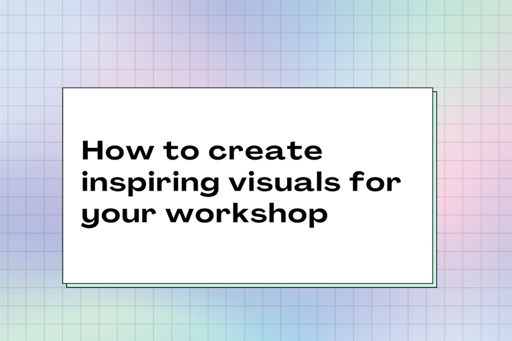
If I am creating a presentation from scratch, I’ll start with the first slide, and keep it very simple before moving on to the next one. Always asking “what is this slide saying?” The first slide will be the title of my discussion, which will be visible to everyone joining the room. It sets the tone for what the topic will be about. If we were creating one around the topic of designing workshop slides, it might look like this:
I think the most important thing to remember is that each slide should have its own purpose, and not be overloaded with text. Where possible, use an image rather than words and think about how we might convey this message visually. Always start by defining the message and asking what the key takeaway for participants is. You can always further explain verbally.
When choosing an image, consider the audience and their context- a local photograph they can relate to, or a familiar face will often have more to say than a generic stock image.
Text will likely be used on your slides, and how much text is too much? If you begin planning your content by writing it all out and keeping only the most important parts, designing your slides will be a lot easier. I’d always recommend editing continuously throughout the process to create a meaningful message. If you can say something in 3 bullet points rather than 10, please do! Your audience will have a much easier time retaining the information.
Typography
“Good design is invisible”
Unless the subject of your presentation is about typography, it’s probably not the best time to be cracking out your most recently found, favorite font that’s “a bit different” or unusual. Stick to standard, trusted and most legible fonts that audiences can read and are familiar with. Otherwise, they’ll distract from the content. And content is King.
“Good design is invisible”, a true and very useful phrase from Dieter Rams, who considers functionality in design as honest, long-lasting and with as little design as possible. This is a good theory to take throughout the design process. When looking for the right font, consider the tone you are using throughout your delivery too, and the overall message you are giving.
Good typography is your best friend for a presentation. When creating visuals for screens, as mentioned before, we are not typing out our speech word-for-word. Any text that is visually presented will have a very definite purpose as to why it is being displayed. This might be a quote, some data or the title of a book along with some further information in short form. Presentation slides are not a book.
Legibility is the most important thing when it comes to designing your visuals. Sans serif fonts are typically the best option for reading on a screen. Help your audience understand what you are communicating as quickly and easily as possible by ensuring the font sizes are easy to read.
Create contrast and visual interest by choosing two fonts, one for headers and one for any body text. The contrast should still be harmonious, and not jarring to the eyes. Font hierarchy can help the audience differentiate between key points and more specific information. By choosing different weights and sizes, you can ensure your message is clearly heard and understood.
- Minimum font size for main copy and bullets: 18 points
- Preferred font size for main copy and bullets: 24 points
- Preferred font size for headers or titles: 36 to 44 points
Personally, I like to choose font sizes slightly larger than recommended for body text. When we have a text-heavy page, I prefer to give the text plenty of surrounding white space and edit the copy as much as possible. From a design perspective, it helps legibility; and from a content perspective, it doubly ensures only the relevant text is presented on screen. I would definitely edit again at this stage. In this example for screens, the body text is 28pt and written in Open Sans, and the “Ideate” heading is 44pt in Agrandir wide.
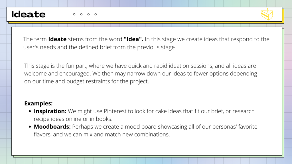
Before creating any printed material for presentations, consider if it will truly be used and the environmental impact. I’d usually opt for sharing a digital version for people to refer back to after the workshop. It’s good practice to create a black and white version so that if it is printed out, the printing costs will be lower. There are of course digital accessibility issues, and some people might prefer a printed version. If so, select a serif font for any long text in a workbook or feedback form, with a minimum font size of 10-12pt.
Key points:
- Use Contrast
- Legibility
- Brand
- Tone
Colors
Deciding on the color scheme for a presentation is one of my favorite parts! Of course, you may have been given a branded color scheme to use, but if you have free reign in color choice and you enjoy the creative process, it can be a lot of fun.
For my show and tell on Design Thinking, I used the analogy of baking a cake and I felt that they conjure up an image of pastels. I used a gradient on the background so that I could use an array of colors without it being overbearing. I selected five key pastel colors for each stage of design thinking and to evoke a playful feel throughout. I was careful not to allow the colors to take over, so you’ll primarily see black and white use of color at the forefront for legibility.
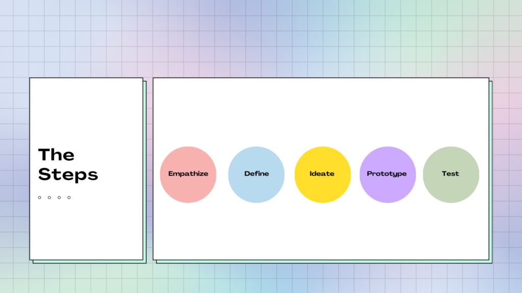
Here are the key elements of how to choose a color scheme to complement your content:
Contrast
The first, and most important point when choosing colors, is to use contrast. Make sure your text and graphics stand out from the background and are easily seen. Contrast is the difference in opposing colors so that they don’t blend in together A light background should use dark text and perhaps one or two bold accent colors to highlight key points. A dark background should use light fonts.
If you’re unsure of how easy a slide is to read, there are an array of online tools that can check the contrast for you by following the web accessibility guidelines. On Contrast Checker, you can enter the HEX code of the background and foreground colors, and you’ll get an idea of legibility. The sliders in the tool can be used if you need to improve the contrast and amend the color choices. There are also resources to guide you in how to select the color with an online eyedropper tool in case you’re not familiar with the HEX color codes.
Another contrast checker tool also shows the background and foreground with text examples and gives a rating to the accessibility of the text. This website has a whole host of tools, and can even pick a suitable palette for you.
Branding
If you’re working with a client, they may already have their own brand packaging and presentation template, including their colors. You may feel that this removes your choice of colors as it has been decided already, for example, they may use an in-house color language to refer to particular data on a graph. But the opposite may be true and might mean further considerations for visuals. It is important to know how to choose because when you create graphics or diagrams because you may have to select colors so that explanatory text can be seen on top of a shape or part of a graph.
When working with a client, it is important to share any documentation with their design team, and the best way to do this is by providing editable files. Working with a designer can massively lift the load on creating your presentation visuals. If there is no design team, but you are given design assets to work with, sharing both your visuals and your presentation agenda for collaboration and sign-off is a must. Create your agenda in SessionLab, and attach your visual presentation for ease of sharability.
Emotion
Studies have shown that color has an effect on expressing or feeling emotions. It will help to consider the tone that you are using throughout your presentation, the message you are delivering, and how you might want your audience to feel.
Warm colors, in the middle of the color spectrum, that aren’t too bold or too light create a warm and comfortable feeling. Bright reds and oranges can feel energetic and powerful. Or even create a sense of danger. In contrast, cooler colors such as greens, blues and purples can feel calm or evoke a sense of sadness.
We have an exercise that can help identify emotions and grow a better emotional vocabulary, the feelings wheel. It includes a visual attachment displaying the emotions in a range of colors- this may help select a tone for your color scheme.
How to choose an engaging presentation format
Intro
We are almost there! The content is edited and your visual slides are ready, the next stage is to consider the format in which you’ll deliver your workshop or meeting. This is when you can consider any additional tools that you can use to your advantage when presenting. This might be video, photography or visual data. Or even props. Consider which other visual aids may help people to better understand the process or story you are conveying.
What presentation method will keep them engaged? How will you inspire and capture their imagination?
I’d recommend simplicity, and not try to include every form of media. Consider the purpose and message and select which format delivers it most effectively. Used with intention, video can be great. But animated graphics or flashy text is unnecessary and will add to the cognitive load of your audience, especially if they have any visual impairments.
Video
Video can be very effective, so long as it’s kept brief. If it’s longer than a minute, you may lose the attention of the audience, and the momentum of your presentation. A film clip should be creative and add another dimension, not an infomercial or promo piece, it’s a tool to say something that you cannot put across otherwise.
Films can have great benefits of showing a story. In a TED Talk about the intelligence of crows, the scientist showed a clip of the crow bending a hook to create a tool and fish a piece of food out of a tube. It put across his point better than anything he could’ve said.
I use recordings in situations like this, to demonstrate a case study. It’s often more powerful to have the original storyteller sharing their experience than me giving a second-hand account of the tale. Bringing in other voices in this way can add further diversity to your workshop.
Still images
JPEGs are compressed files and are used for photo formats. When a photo is taken, it is a RAW file that is editable. Once it’s compressed to a JPEG, it retains around a tenth of the information, meaning it is a smaller and less detailed file. JPEGS are used in photography, but not in vector graphics (drawings, typography, graphs, etc), as the detail lost can create pixelation if you aim to blow the image up to a larger size.
PNGs retain detail and are editable. They are still compressed files, but the pixels aren’t lost. Any graphics you create should be saved as a PNG, as you’ll be able to keep the image sharp, regardless of the size.
The photography you choose must be relatable. I’m definitely not against stock imagery per se, it’s amazing to have access to a library of searchable images to strengthen what you are saying. But, often you’ll see the same images repeated in different workshops and presentations and they’ll start to lose their meaning, or become too familiar. There are great free resources like Unsplash and if you spend time looking for a more unique way to put your point across, there are lots to choose from.
I’ve also had an Adobe Express subscription which gives access to photography and graphics and templates which you to customize in editing with little design skills. Ideally, being able to take your own photographs, or work with a professional photographer to capture exactly what you want is going to give your audience a far more unique experience. This is often a luxury.
As facilitators, a way around this could be to create our own library of photos that we capture at each presentation. When I’ve run crafting workshops, it feels quite natural to take photographs of the work we are creating. And those who are camera-shy, they’re more open to photographs of their hands in action. Over time, we’ll have a whole collection of resources.
If you enjoy photography, having a good camera as part of your kit might intrigue people, invite people to take photos of each other and the workshop process. This could be an exercise that you do to open or close your talk. Or in some cases, especially if it’s a visual presentation, and not too distracting, invite people to take their own photos and share after with a #hashtag (promo and photos in one!) And of course, get everyone’s signature attesting they are OK with photos.
Visual data & symbols
Visualizing data makes it more interesting, engaging and memorable than cold hard figures. For the majority of audiences, it’s easier to understand in a visual format than in a list of forgettable numbers. By creating charts, graphs or maps, we are able to see patterns and understand the context of the statistics. A pie chart displaying percentages in corresponding colors tells our brain quickly which section has the largest number.
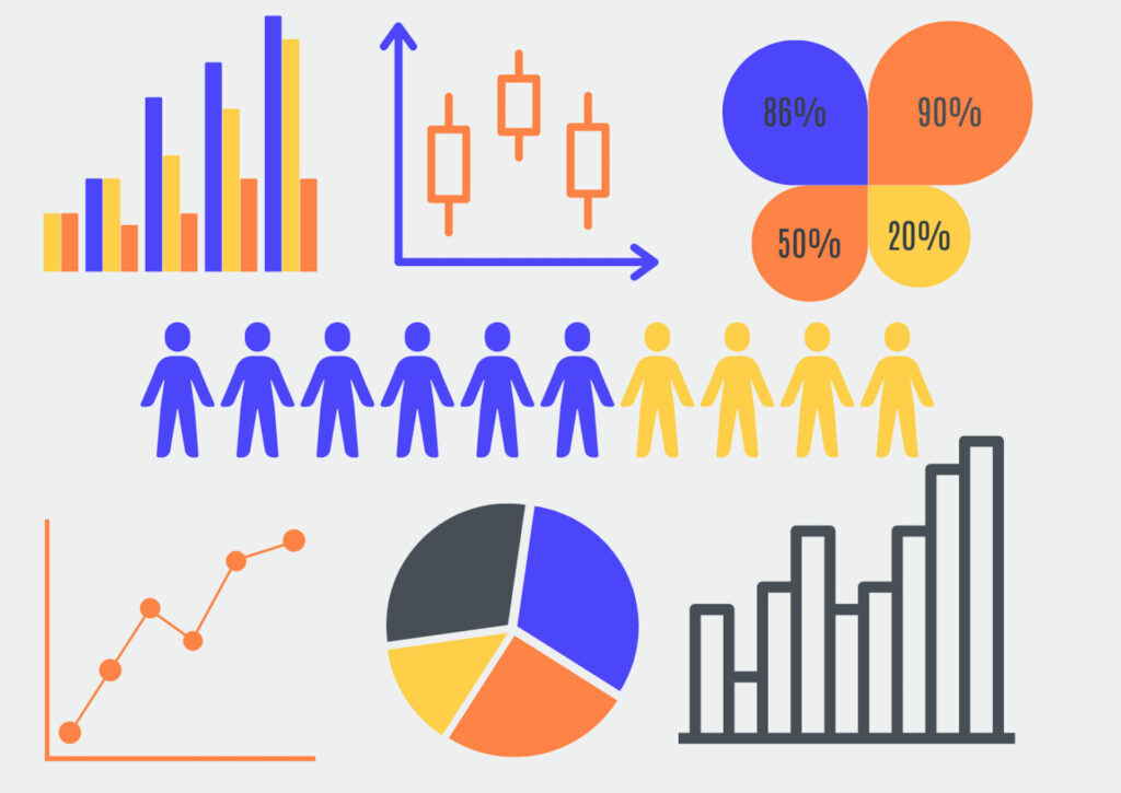
Even when we analyze word-driven data, a visual representation is easier to see straight away. When I’ve worked with community groups in the design thinking process, we’ve often used Google surveys to capture written evidence. This type of qualitative data can be a challenge to sift through, so for an initial overview, a tool like word cloud can show how many times a particular word or phrase appears and turns it into an image. The more times a word appears, the larger it is on the image.
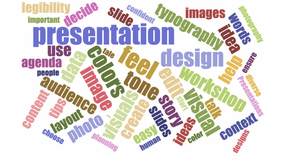
The use of icons and emojis (sparingly! And in context 😉) can add another element of visual understanding to presentations. Illustrations and hand-dawn symbols might better express your point than a photograph too. An opportunity to work with a live scribe or graphic facilitator whilst presenting could add an interesting dimension to a talk. If it involves audience participation, having someone on hand to capture the conversation visually can keep engagement and attention going!
The best tools for designing your presentation
Canva
Canva has become a much more powerful tool than it was. You can even edit your workshop recordings with it now! It’s perfect for anyone with little design knowledge as it has great templates for presentations, lots of which are free. It has social media templates too, which are perfect for advertising your upcoming workshop.
Adobe Creative Suite
I do love Creative Suite, and it still is a great package of tools for designers. Photoshop, Illustrator and InDesign are the industry standard for design tools and have all the capabilities you’d need as a graphic designer. If that package is beyond your scope, Adobe Express is a great option for pre-made templates and stock imagery. Like Canva, it also works well as an app on a smartphone.
Keynote
Keynote comes as standard with MacBook and has had a whole new upgrade including being able to use the camera on your Mac or an external camera to show yourself directly on the slides. Super handy for an online event! You can also show the screen of a connected iPad or iPhone and it now has co-hosting capabilities.
SessionLab
Of course! SessionLab is where you can keep all of your presentation notes, and break down the agenda into blocks, so if you decide to switch up parts of your presentation- you can drag and drop to a different section of your talk. It is a much easier process, as it will also keep any other attachments or exercises in that block neatly collated in one place. It’s easy to share with any co-hosts or clients before the presentation day arrives!
How to deliver a workshop presentation with visuals
Practice
Some people memorize their speech word for word, which can work well if you’re a dab hand at amateur dramatics.
On the other hand, that might feel too stressful or rigid. Bill Murray is famously known to read a script once and throw it away! For you, it may be better to consider the key points you’d like to make, and really know your subject matter so whatever arises, you’ve got it covered. Your visuals might act as a prompt for you too, the main message will be communicated visually, and you can feel free to go into more depth.
The best way to ensure that you nailed the slide design for your session is to practice. It’s important to practice noting your timing, that you’ve covered all the important points, and that each slide transitions smoothly from one to the next. You want the presentation to be as seamless as possible. The best way to practice is in front of someone and gather feedback.
Before our design thinking for beginners show and tell, I rehearsed in front of my fellow team members, instructing them to wear their “facilitator’s hats” whilst listening, so they could hear from a facilitator’s perspective and give constructive feedback.
Afterward, you can continue to add and edit, removing some sections, and making room for more key discussions to be had in-depth. If it is an informal presentation that you will run more than once, it could develop over time. If it is a one-off very important meeting, it’s vital to get as much preparation practice as possible.
Expect nerves
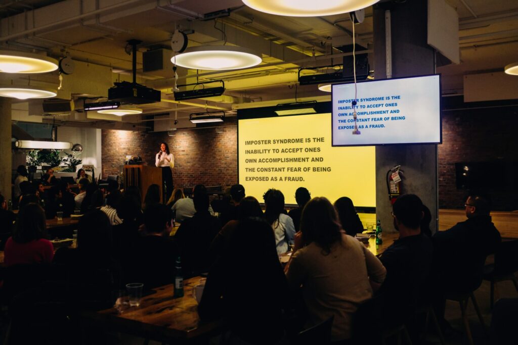
If I get nervous, I purposely talk slightly slower than I usually would naturally, and it calms the nerves down. There’s also no harm in mentioning that you’re nervous, it’s an honest approach and can create an authentic connection.
We’re all human. And no one would expect you to not be nervous. Nerves, to an extent, can be a good thing. They bring a bit of energy and focus to your talk, and a little adrenaline. If you know your subject matter inside out, all you really need to do is breathe, and talk.
Speaking with one of our community members, Yvonne Chin Irving on the subject of nerves, she suggested diaphragmatic breathing, or more a more fun term, “balloon breathing”:
Belly breathe. Slowly. Imagine your tummy has a balloon that fills up when you breathe. Exhale all the air. Notice your tummy as it flattens. Next, breathe in slowly and fill your “balloon” with breath 🎈. Do this a few times to help calm yourself down. You can start this on the way to your session, do it in the car or while you’re setting up for your session. (It really works)
Yvonne Chin Irving
We’d love it if you joined the conversation in our SessionLab community!
Tech check
Having a technical rehearsal beforehand can help avoid blips. Ensure the right people have screen-sharing abilities, and that screens in the in-person space work. Iron out any microphone issues or problems with echo prior to the big presentation! On the day itself a technical disaster could strike, so here are some practical tips to circumnavigate these and stay professional:
- Create different formats for your presentation. If it’s a Keynote or Powerpoint, have a PDF version available in case of any tech issues you’ll still have a high-quality version available.
- If including video, have backup screen-shots as images to demonstrate your points in case the video doesn’t run.
- Be analog ready. Know your presentation without the use of slides- or print them out so that if there is a complete technical breakdown, you can confidently present. This might include creating printed handouts for people to refer to when you direct them to do so. Or, if they have their own smartphones, send them the link to your visuals or any important videos to watch back after your talk, to avoid distractions as you speak.
Accessibility
Ensuring your audience has the best experience, requires being aware of accessibility needs. Is access to the building easy for anyone with physical disabilities? Are the seats comfortable, and allow for ease of viewing for people of different heights?
We’ve discussed the best way to use typography for ease of reading for anyone with visual impairments, and when setting up your screen, it is a good idea to see how it will look in the actual event environment. Additionally, you may share larger-print handouts on yellow paper for anyone with dyslexia. This is another reason why knowing your audience in the planning stage will make sure your presentation is enjoyable and accessible for everyone.
Agenda planning
SessionLab is an agenda planning tool that makes presenting a lot smoother! You are able to allocate time to each section of content to keep yourself on track throughout. In your preparation stage, you can attach all of your materials to your SessionLab agenda, knowing exactly when you’ll use each of them. It’s so neatly organized and easy to edit and shift blocks if you decide to change the order of content for a future session.
In conclusion
I hope you have found this guide valuable, and that it inspires lots of ideas when planning your next presentation! There are a wealth of resources dotted around this article, and I’ll include a few more here that I highly recommend:
Lean Presentation Design A whole website by Maurizo la Cava dedicated to presentation strategy
Ted Talk: How to Write Less, but say more is an excellent talk by Jim VandeHai about short and effective communication.
Let us know below in the comments if you have any questions, or any tips of your own to add to the conversation!


Leave a Comment