Affinity Map
Most of us are familiar with brainstorming—a method by which a group generates as many ideas around a topic as possible in a limited amount of time. Brainstorming works to get a high quantity of information on the table. But it begs the follow-up question of how to gather meaning from all the data. Using a simple Affinity Diagram technique can help us discover embedded patterns (and sometimes break old patterns) of thinking by sorting and clustering language-based information into relationships. It can also give us a sense of where most people’s thinking is focused
Goal
To put ideas into a structured format
Materials
Instructions
Flow
1. On a sheet of flip-chart paper, write a question the players will respond to along with a visual that complements it.
2. Ask each player to take 10 minutes to generate sticky notes in response to the question. Use index cards on a table if you have a group of four or less. Conduct this part of the process silently.
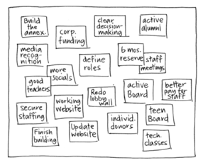
3. Collect the ideas from the group and post them on a flat working surface visible to everyone. It should end up resembling the following figure.
4. Based on guidance from the players, sort the ideas into columns (or clusters) based on relationships. Involve the group in the process as much as possible. Have the players approach the wall to post their notes—it saves time—and allow them to do an initial, general sorting in columns or clusters.
5. Create a sticky-note “parking lot” close to the display for ideas that don’t appear to fall into a natural category. Redundancy in ideas is OK; don’t discard sticky notes because they’re already represented. It’s helpful to leave repeated ideas posted since it indicates to the group how many people are thinking the same thing. At this stage, ask the players to try to avoid searching for higher categories and simply to focus on grouping the information based on the affinities.
6. Once the content is sorted, ask the group to suggest categories that represent the columns you’ve created and write the categories they agree on at the top of the column (or near a cluster if you chose a cluster rather than a column display). Don’t let the players spend an inordinate amount of time agreeing on a name for a category. If there’s disagreement over “Facilities” versus “Infrastructure,” write them both. If the players produce categories that are significantly different, pay attention to which category gets the most approval from the group and write that one. Your visual may end up looking like the one below.
Note: The value of the Affinity Diagram game increases when two conditions are met. The first is that the players generate multiple data points, ideally with good information. The second relates to the quality of the sorting. The cleaner the players’ insights when they form relationships within the content, the better the categories will be.
Attachments
- affinity map cover.PNG
Background
The affinity diagram was devised by Jiro Kawakita in the 1960s. It is also referred to as the KJ Method.
Source: Gamestorming